Print Media
Along with digital content design, I’ve also worked extensively with card game design. Examples of microcopy on game pieces (cards) and game boxes can be found at my Boilerplate Media site.
Digital Media
Additional examples of digital micro copy can be found in the Case Study: Brand Site Overhaul.
The Client: Texas School for the Blind and Visually Impaired
Texas School for the Blind and Visually Impaired is undergoing a complete revamp of their web presence. Mobile interfaces need to prioritize accessibility for visual impairment.
Doug’s Role in the Project
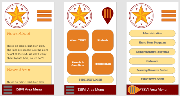
As the content designer for TSBVI, I created designs that worked seamlessly between full screen, zoomtext magnification, and mobile views. These are some of the prototypes that went into the project. Because text can be difficult for users with visual impairment, the actual microcopy was deprioritized in favor of iconography.
The Ask: Create Mobile Regions that Replicate Full Site Regions
The TSBVI user base is non-technical and needs simple landmarking at all viewports. Users rely on both phones and zoomtext to interact with the site. The transition from full screen to mobile needs to replicate each interaction zone as faithfully as possible.
Full Screen Viewport

- design prioritized “regionalization” within a page, regions are:
- main nav area menu (far left menu)
- frequent pages (left orange grid)
- family menu (right buttercream grid)
- news (two column main content)
- legal requirements (footer)
- two column design, each column approximating the width ratio of mobile viewports
- large, friendly “buttons” for ease in tap-ability
- main buttons approximate the Braille characters for “TX” (Texas)
Menu Decomposition for Mobile
- mobile sizes use regionalization for display priority,
- mobile starts with the “news” region
- right hamburger menu decomposes to “family menu” — the most frequent visitors on mobile devices are parents and students currently enrolled, so the “family menu” was given priority
- footer hamburger menu decomposes to “main nav area menu” — these are the departments or areas of work that TSBVI engages in

Mobile View on Regular Content Page

“Regular” full content pages were also given a unique mobile interface, allowing for quick jumps to page sections without repetitive scrolling. The TSBVI “star logo” slides out the “On This Page” menu, keyed to section headings. This slide-out is also used as a left floating menu at full screen viewports, making the full screen to mobile connection easy and obvious.
The “Braille menu” in the upper left slides down either the “family menu” (left orange dots), as shown above, or a menu for “related information” (buttercream dots), which is an additional region at the end of full content pages.