The Client: FourKitchens.com
On the occasion of their 10th anniversary, the Four Kitchens web design firm’s site needed an overhaul. Their expertise was in building content-heavy “big websites” like NBC.com, Entertainment Weekly, and Successful Farming, but using those tools on their own site created an unnecessary burden with no deliberate user paths to get from landing to the contact form.
The Ask: Be Conversational, Be Expert
Re-envision the site to present customer-first content, capitalizing on the warmth and human interaction that they considered a hallmark of working with the Four Kitchens team. Explain what the company would do for the customer, how they would do it, and get customers to call or email in order to “start a conversation” as quickly as possible.
Doug’s Role in the Project
As a content strategist with the company, I was given the internal job of being content strategist and designer for this project. Information architecture, language testing, user flows, content design, and copy-writing were under my purview, as I worked with a front-end developer, UX designer, and product owner to realize the project.
The Inspiration: We Make Content Go, Dog, Go!
The company was pivoting away from building big websites to instead emphasize builds with fast load times, playing to Google’s new (at the time) AMP services. After iterating several dozen new taglines for the company (transitioning away from “We make BIG websites”), I was reminded of one of my favorite childhood books — “Go, Dog. Go!” by P.D. Eastman — and used that as my inspiration. The company founders loved “We make content go.” for the new tagline and I had a creative anchor for the rest of the project.

The Strategy
Move away from Drupal in favor WordPress to cut back on technical burden; highlight the people over the product by making the website feel like an ongoing conversation; score “nerd points” whenever possible in order to make customers’ teams feel like part of the in-crowd; use “fractal” repetition — both linguistically and visually — to create a driving rhythm that echoed the new tagline (“We make content go.”)
“Talk to us!” Friendly CTAs on Every Page

The main goal of the redesign was converting visitors to customers via the contact form. The client emphasized a tailored approach for each client, so a one-size turnkey solution was not on the table. We needed to get the visitor to reach out, either via email, phone call, or the contact form.
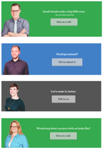
- each page had a bottom banner CTA
- each CTA featured a different management team member
- each banner had a tagline in the featured team member’s voice, allowing for additional points to inject “nerd jokes” or puns (e.g., “Feeling content?” on the Content & Publishing page)
- CTAs written in casual language (e.g., “Give us a call.” “Tell us about it.”)
Break It Down

Building a website can be a big project with a lot of steps and phases. We needed to make that process more digestible.
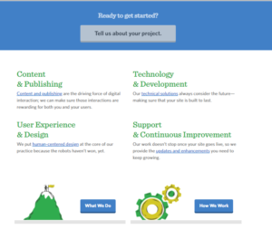
- we broke the web design process down into four main areas, reflecting the “four” of Four Kitchens
- each area covered two topics, allowing us to use the “&” ampersand to create rhythm in headers
- forced line breaks to put the “&”at the beginning of the second line of each heading, allowing visual rhythm to echo linguistic rhythm
- each area given a ~20 word description
- Learn More CTAs (“What We Do” and “How We Work”) advance the user journey
- Contact Form CTA (“Tell us about your project.”) for immediate conversion if these micro descriptions were good enough

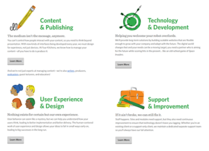
Additionally, a unique “Services” page was created to expand on these areas, with subpages for each process area.
- visual interest expanded with unique icons for each area
- area description expanded from 20 to ~50 words
- each area given a unique tagline, often referencing a “nerd joke” (e.g., “The medium isn’t the message anymore.” or “Helping you welcome your robot overlords.”)
- Learn More CTAs for each area, leading to unique process subpages
Language in Action: Glossary Building

The given-new paradigm in linguistics shows that people process information best when known (given) information comes before new information, when new information builds on the given, and when shorter chunks come before longer chunks.
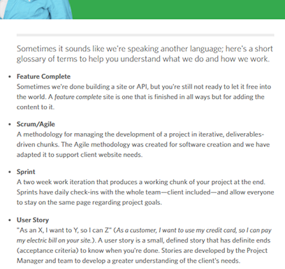
However, when a wholly new piece of information is presented, it’s best processed when highlighted as a stand alone chunk. This was the impetus behind the “glossary.”
- content component following the personal CTA banner at the bottom of a page
- terms keyword-coded to rotate on page load, but remain relevant to the page content
- draws reader’s eye down to over CTA in the site’s footer
- homepage Learn More CTAs (“What We Do” and “How We Work”) repeated in-text to milestone a user’s personal journey through the site
Consistency and Repetition
“Dog. Big dog. Little dog. Big dogs and little dogs. Black and white dogs. … Go, dogs, go!”
P.D. Eastman’s Go, Dog. Go! didn’t just inspire the new company tagline, it inspired the entire ethos of this project’s design. Start small, repeat and build on repetition, always return to the hook.
The “four” of “Four Kitchens” was my dog in a racing hat for this project — as often as possible, we chunked information into groups of four. We repeated visually, linguistically, and typographically to give the visitor as sense of momentum, driving them towards the goal: reach out, fill out the contact form, start a conversation.
The company site, content, and messaging were reimagined from the ground up, starting with a hook, a promise, that “We make content go.”